Now all that is left is bringing it all together with a dashboard. You know have almost all the elements you need to make a compelling presentation on a dashboard – After all they are just a collection of worksheets with some connections and instructions for the users.
Where to begin? With a wireframe of course – well not actually wire but a sketch of where you want to end up and it is best done with a paper and pencil – (very old school) – Yes it is messy – but the few minutes you spend on planning will pay off:
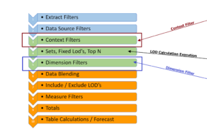
When you create the wireframe think about the image (chart types) you want to use and specifically what you want to convey in each chart. Also how are you going to connect the images – Filters? Sets with Set Action or Parameters.
Now do a quick check of you own skill level –
so you know how to create each chart and how the use the connectors – If not make a small, simple example to work out any questions you have –
I can’t tell you the number of times we get a workbook that has a half dozen dashboards with worksheets to match and the users says it doesn’t work. – Sadly, it is often a fundamental error that means starting over.
Next Create the worksheets
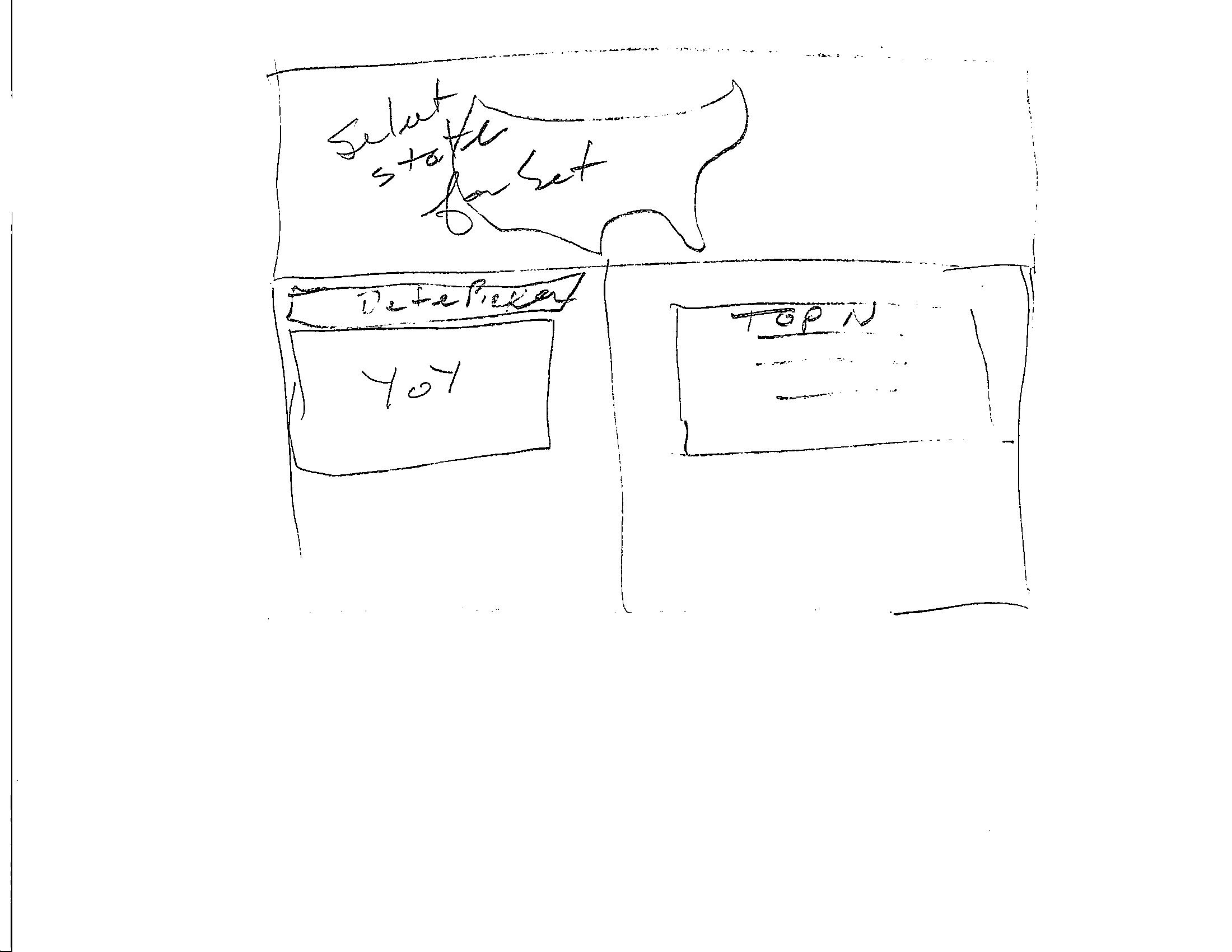
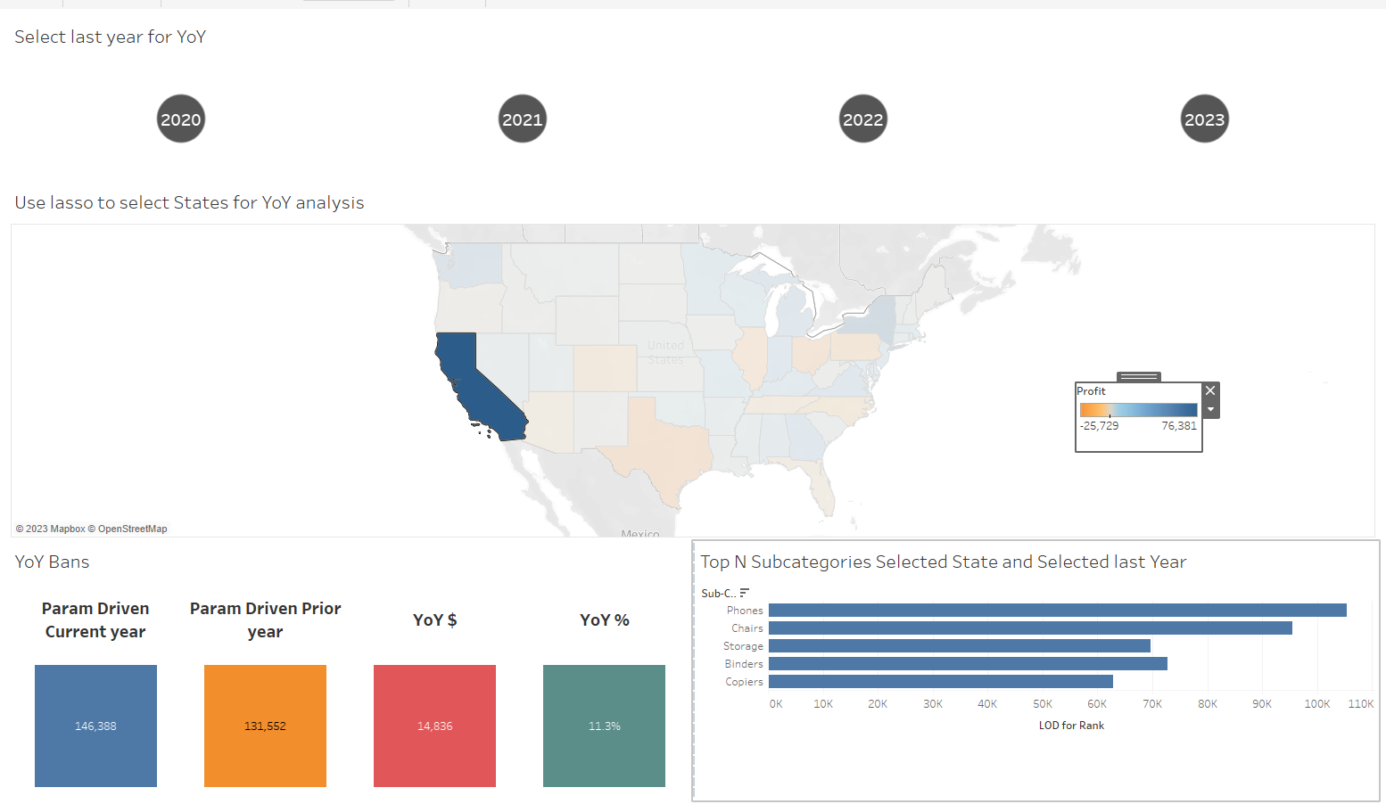
We need a way to select the last year for the YoY calculation – I like using a parameter so I set up this

I also plan to use a Set on State so the user can Dynamically change the state(s) used in the YoY
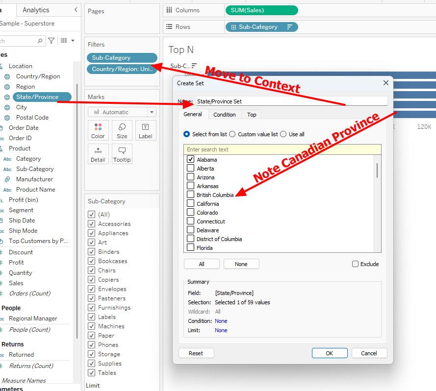
So I created this Set – not the set still includes Canadian Provinces so I added a Country filter which I will move to Context ( Why?)
and finally we need a way to get the Top N – and here we need to use an LOD and a Ranking function – we can use the current year LOD as
{ FIXED [Sub-Category]:sum(if year([Order Date])=[Select End Year for YoY] then [Sales] end)}
The Rank Filter is set to True
Rank_unique(sum([LOD for Rank]),'desc')<=[Top N for Bar Chart]
Next we need a Current and Prior Year Calculation we need to include the State Set and the Year
So the Current year (based on the parameter) is:
{ FIXED [State/Province Set]: sum( if [State/Province Set]
and year([Order Date]) = [Select End Year for YoY] then [Sales] end)}
and the prior year is
{ FIXED [State/Province]: sum( if [State/Province Set]
and year([Order Date]) = [Select End Year for YoY]-1 then [Sales] end)}
The YoY $ is
sum([Param Driven Current year]) – sum([Param Driven Prior year])
and the YoY % is
[YoY $ ] / sum([Param Driven Prior year])
All that is left is to create the visuals can connect them with Actions
The Map is simply this – I just put Profit on color

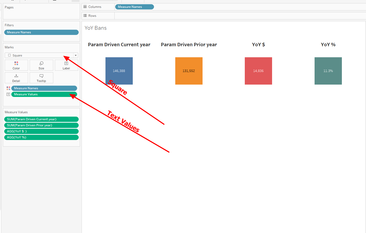
The YoY values are BAN’s – just colored Squares with the value placed in the center as a label
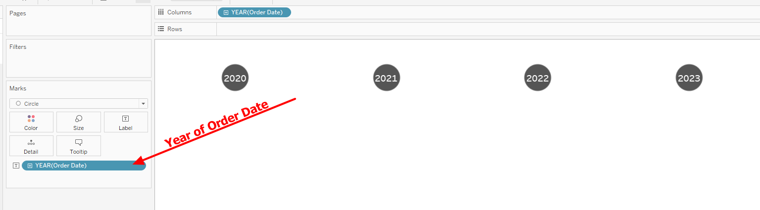
We need a value pick to change the last year parameter – here I just used the Year of the Order Date as a circle shape chart
Now just place the charts in containers on the chart in the proper positions
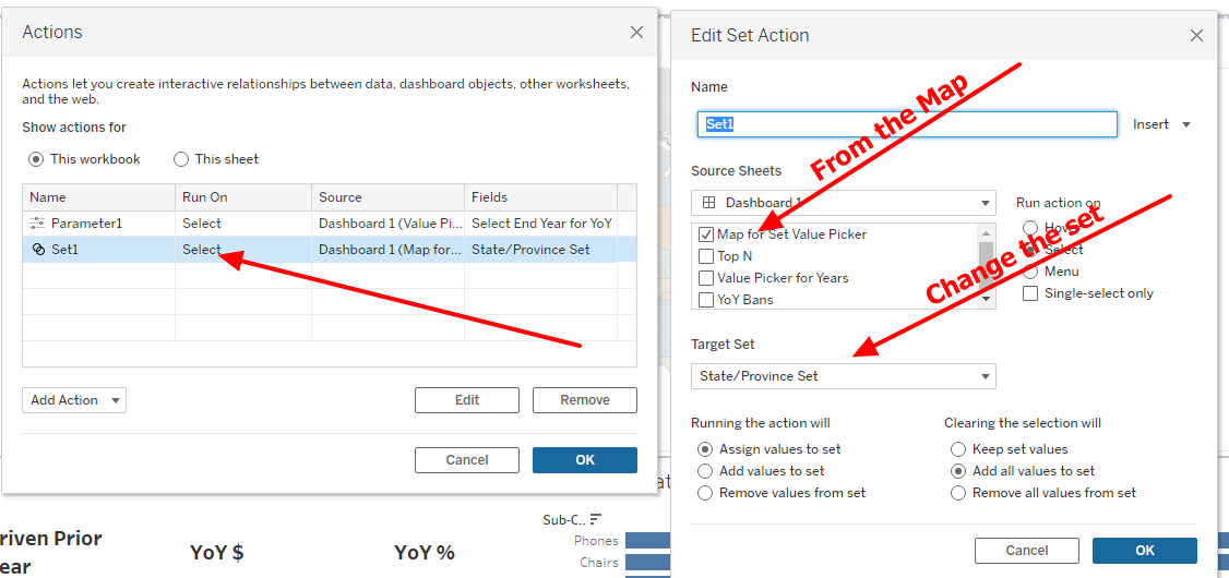
And add 2 actions – first the Year Parameter action
Just Open "Dasboard" on the top ribbon and select Action
Then create a Parameter action

And create one more except this is a Set action
That may seem like a lot yet all we did was create 3 simple worksheets and 2 actions then bring them together on a Dashboard –
Congrats! I hope this series helps you better understand how Tableau works and makes your journey to next level a little easier
Jim