
When and How To Use Scaffolds
The data structure has a huge effect on the results you get from your analysis. Like most of you, I trained using well structured and full data sets – where there was a value in every record (cell) – like a tightly fit puzzle (Note – Presented that the Atlanta TUG in Sept 2021 –
see the recording at YouTube Scaffold link

With real-world data that is often not the case. Data can come from ERP systems, stand-alone third party or public sources and contains voids or is sparse or otherwise badly structured resulting in gaps in the data.

Scaffolding is one way to re-structure the data and fill the gaps.
We are going to look at 3 different frequently encountered use cases where data needs to be scaffolded to solve the problem. The cases are adapted from actual questions that were posted on the Forum – data and names changed
1 – The 2 Date Problem

The '2 Date Problem' is a classic case – each record in the data has a start date and end date and you need to look at all the periods in between. It comes up when you need to count the active programs, total cash flow over a series of mortgages or annuities, or, as in this example count headcount over time.
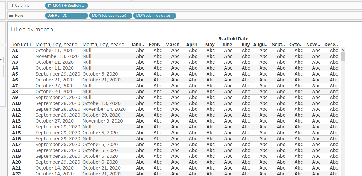
The question came from an HR manager who had many open positions. Each had an "open date", some had been filled and others were still open. The manager wanted to count all the open positions and separately those filled by month.
The data looked like this:

Each requisition had start and end dates as independent values but there was no calendar common to every record. The solution was to build a calendar using a scaffold. In this case, the manager was only interested in monthly totals so a monthly date ladder would suffice:

The scaffold and the base data were joined so that every record in the base data was connected to each record in the scaffold – a "Cartesian join" – with a 1=1 join clause

Using the scaffold date resulted in a calendar that included each job requisition
All that was need were 2 LOD expressions to count the filled or open jobs by month
the filled LOD is
{ FIXED [Job Ref ID1] , [Scaffold Date]: countd( if not ISNULL([Job open date])
and DATETRUNC('month',[Job filled date])=DATETRUNC('month',[Scaffold Date])
then [Job Ref ID1]end )}
and the open LOD is
{ FIXED [Job Ref ID1] , [Scaffold Date]: countd(
if DATETRUNC('month',[Job open date])<= DATETRUNC('month',[Scaffold Date])
and ( DATETRUNC('month',[Job filled date])>DATETRUNC('month',[Scaffold Date])
or ISNULL([Job filled date]))then [Job Ref ID1] end )}
and the result looked like this

 2 When drilling down breaks the analysis
For those not familiar with EPR systems and the forecasting to production process, a quick review. The ERP system records sales directly from the sales invoice. That data is precise – we know the customer, the date, the SKU (stock keeping unit), the unit quantity, and the dollar value. The data can then be aggregated along several different hierarchies – here along the product and is still very accurate although somewhat less useful

Forecasters and product managers will use the sales history to create a rolling forecast that is used by the production planning and purchasing departments to develop the production schedule. The process starts at the top of the pyramid and works downs, each level being a lower level of aggregation that is more useful to the planner but less accurate than the preceding
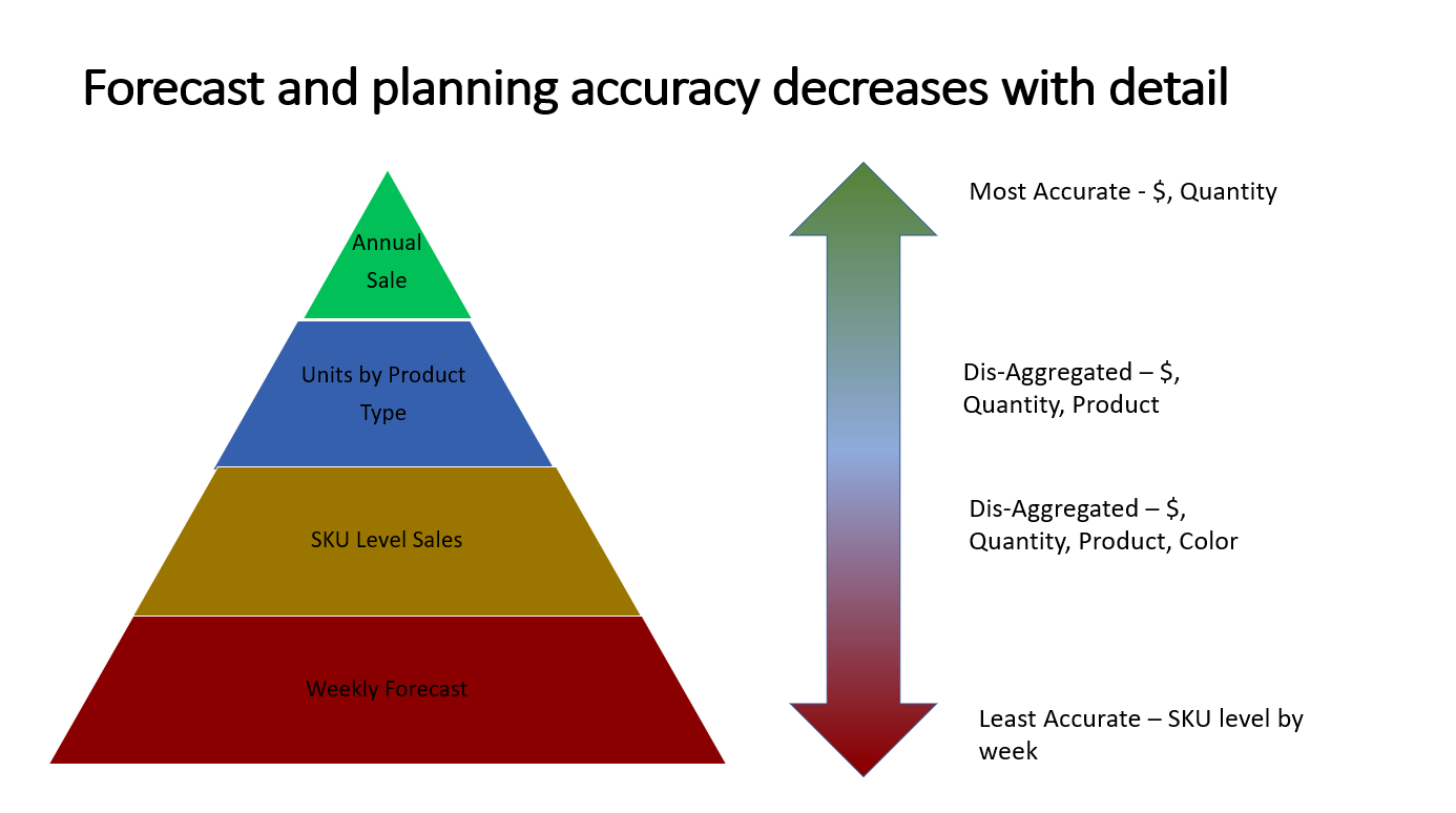
Forecasts are usually adjusted monthly along a 3 or 4-month forecasting horizon. The production schedulers take the lowest level -Units by SKU by week and schedule production, purchase components, and plan inventory levels. While the forecasting and planning process are numbers in the system and the results become less accurate at lower levels in the pyramid, actual production and inventory levels are precise. You know exactly how many units were produced for each SKU and the inventory levels.
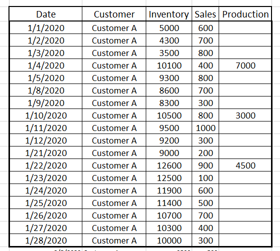

But some results look odd

So let's see what is going on:
and that is a clue to the first problem – Window average is a table calculation that looks at the last 7 records, not days but this is what the actual data looked like when all the records were visible

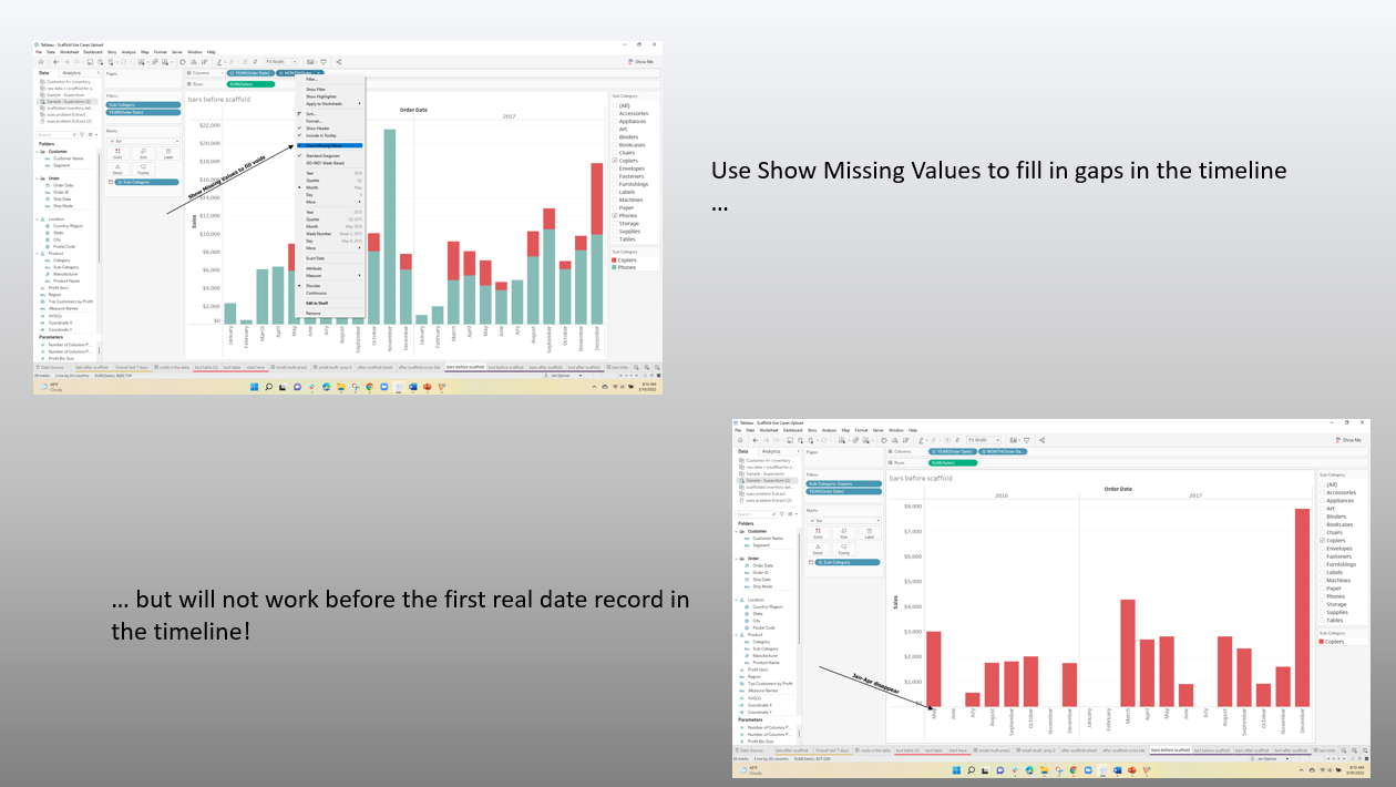
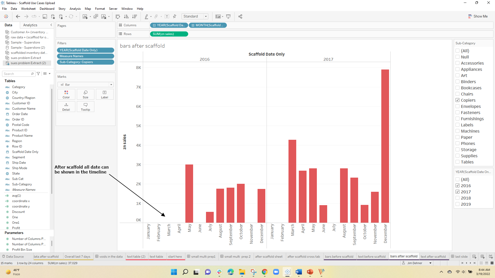
Many Nulls – very sparse data and it is clear that for Customer D there was only 1 sale in the final 7 days and that was for 1000 units so the average did not take into account the nulls. The nulls in the data were "no record null" see Null Types and a scaffold is needed to be used to force a record into the data for each combination of customer name and date.


after scaffolding the last seven-date data looks like this ( note zn() functions and previous applied ) – and the data now runs through the end of February

and the last day summary across the 4 companies is

The actual Days on Hand when the missing data has been included is very different than the original results. This is a case where the planner (the Subject Matter Expert) would not know what the data structure looks like nor should he – that is the role of the dashboard designer and data scientist – It is also a by-product of the data source – the ERP system that could affect your next analysis
 3 Voids in the data

When the date is filtered to February 2016, 4 images disappeared (returned a null)

The user had 2 questions – Why did it happen and then how to correct the problem


But scaffolding exploded the data set to 28,000 records – at the same time it did solve the user's problem

One Response
Thank you for the detailed post