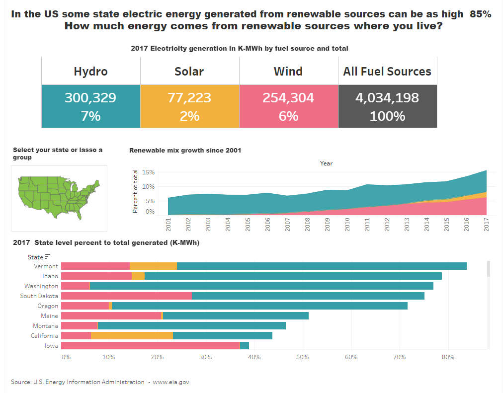
Renewable Energy – How big is it-
A dashboard should tell a story beyond just presenting data. It needs to be interesting and when possible encourage the viewer to interact and investigate to make the story their own. This is the end product

I found a data set that includes the location of every wind turbine in the US – They were concentrated in the mid-west and south Not what I expected at all – I had a lot to learn!

While interesting there wasn't much of having a story from that data – just raised a lot of questions – How much energy do wind turbines produce? Is it a significant portion of overall energy production? What about other renewable sources? How does it vary by state?
What would you do – something like this might work but how would you make that
To start you need data. Lots of data! – Energy generated in Kwh, by generation source at the state level – you could use a search engine and hope for the best – there are also several portals that you could consider
- · DATA.GOV – US Government open data – ties to over 250,000 databases https://www.data.gov/
- · American FactFinder – guided search portal to US Census databases https://factfinder.census.gov/
- · Data.World collaborative access to the open data community https://data.world/
- · Stat.Can is the national statistic office portal in Canada https://www.statcan.gc.ca/
The energy data used here was found at www.eia.gov the US Energy Information Agency site but each energy source had to be extracted separately – (a future post will go through the Tableau Prep flow used to combine and clean the separate energy source files). (Note: Data is for electric energy generation in 2017)
- the portion of the energy generated from each of the renewable sources in each state
- the state rank nationally
- and the trend since the start of the century
That would be a much more interesting story than just the location of wind turbines that got my initial interest. It would also be good if the dashboard was dynamic so individual users could look at their state or region.

Now build on the story including a Trend chart to show growth since the start of the century and a state-level ranking chart to see a comparison throughout the area.


Finally, allow the user to select a state or area and change all the charts accordingly –

To create the State set, Open the STATE pill and Select CREATE then SET

Drag State to the canvas to create the map and be sure to place the State Set on the marks card


Congratulations – you’re done!

Download the actual workbook, complete with “How To” instructions, from my Tableau Public site at https://public.tableau.com/profile/jim.dehner#!/vizhome/RenewableEnergySources/Dashboard1 –
Jim