Comparing measures, viewing distributions and identifying outliers can all be done using reference lines! Easy to use and make your dashboards more user-friendly. But lets's start with the basics:
See the video at Link to RL video
1 The Analytics Tab:
Basic and Custom Reference Line functions can be found on the Analytics tab in the Data Pane:
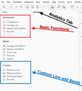
Basic Functions are pre-defined and can be dragged and dropped onto the canvas
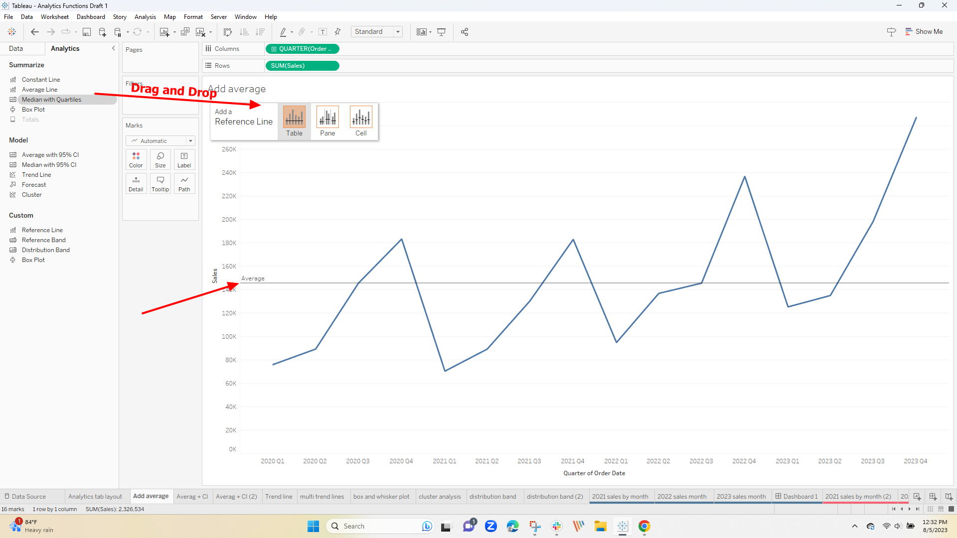
The line can be edited select the line and a window will open where you can change the aggregation, select a different measure (must be in the view), or change and format the line style and text
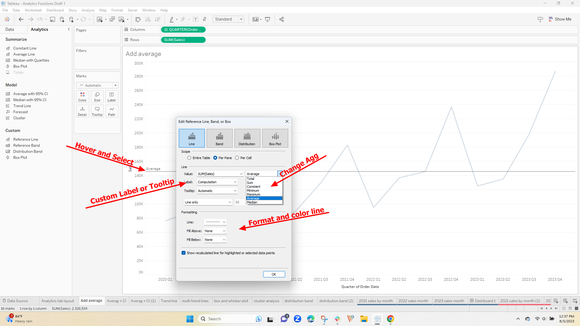
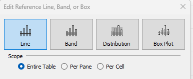
The function can also be changed in the same window. Choices include using a reference band, a distribution, or a box and whisker plot any of which can be applied to the entire table, a pane, or a cell
We will look at some specific use cases later but play a bit with the options to see what each does.
The Custom Line and Band Options portion of the menu is used with the same functions but take you directly to the expanded set of options that you have in the edit menu above.
Dragging the Reference Band to the canvas opens a window that first allows the selection of the axis
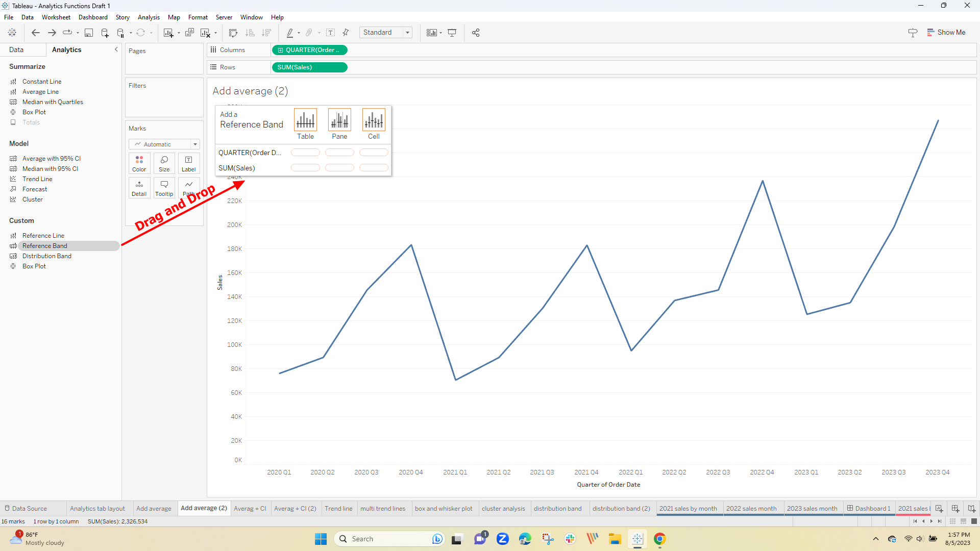
which places the band in the viz and immediately opens the edit window saving a step in the process.
The following use cases will look at each function and illustrate its use beyond the basics
2 Reference Lines
While the Reference Line is the most basic function many options allow you to customize how it looks in the viz,
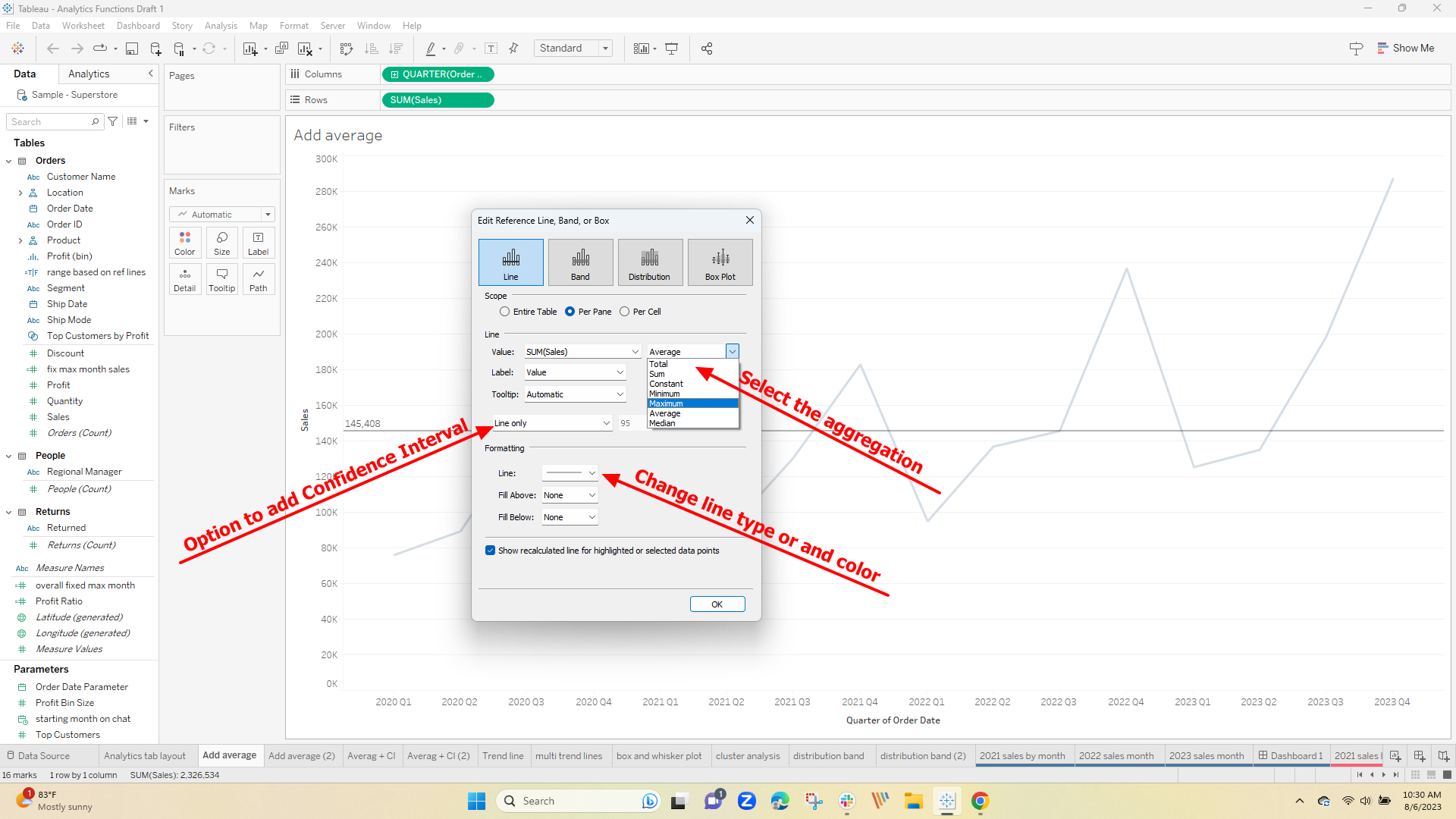
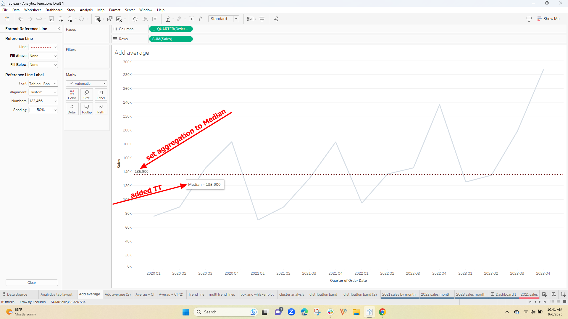
Drag the Reference Line to the canvas and open the editor where you can change the aggregation from the default Average – to any of some common aggregations, add a confidence interval or a Tooltip, change the line type (like to dashes), or the line color:
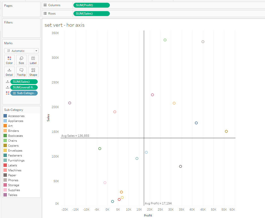
Simple enough on a single axis – how about on both the vertical and horizontal axes like separating a scatter diagram into 4 quadrants? Just add an average reference line to each axis:
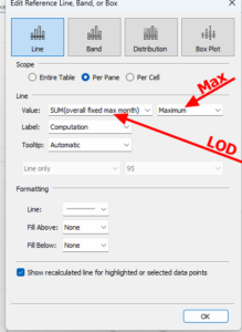
Often users have separate charts but need to align the axes for comparison across all of them in a common view dynamically – Reference lines can be set to a calculated field like a LOD:
Looking across 2 years of sales by month the user wanted to see separate charts on the same dashboard. On each worksheet, I added a LOD to find the total value per month in the database –
This is the sales by month
{ FIXED DATETRUNC('month',[Order Date]) :sum( [Sales])}
and this finds the max overall
{ FIXED :MAX([fix max month sales ])}
The last value is used in a Reference Line to set the upper limit of the axis on each sheet:
The Reference Line for the overall max is well above the monthly value for any month in 2021 yet set the upper limit for the axis which is common to the 2021-2023 period. The resulting dashboard now has the graphs aligned
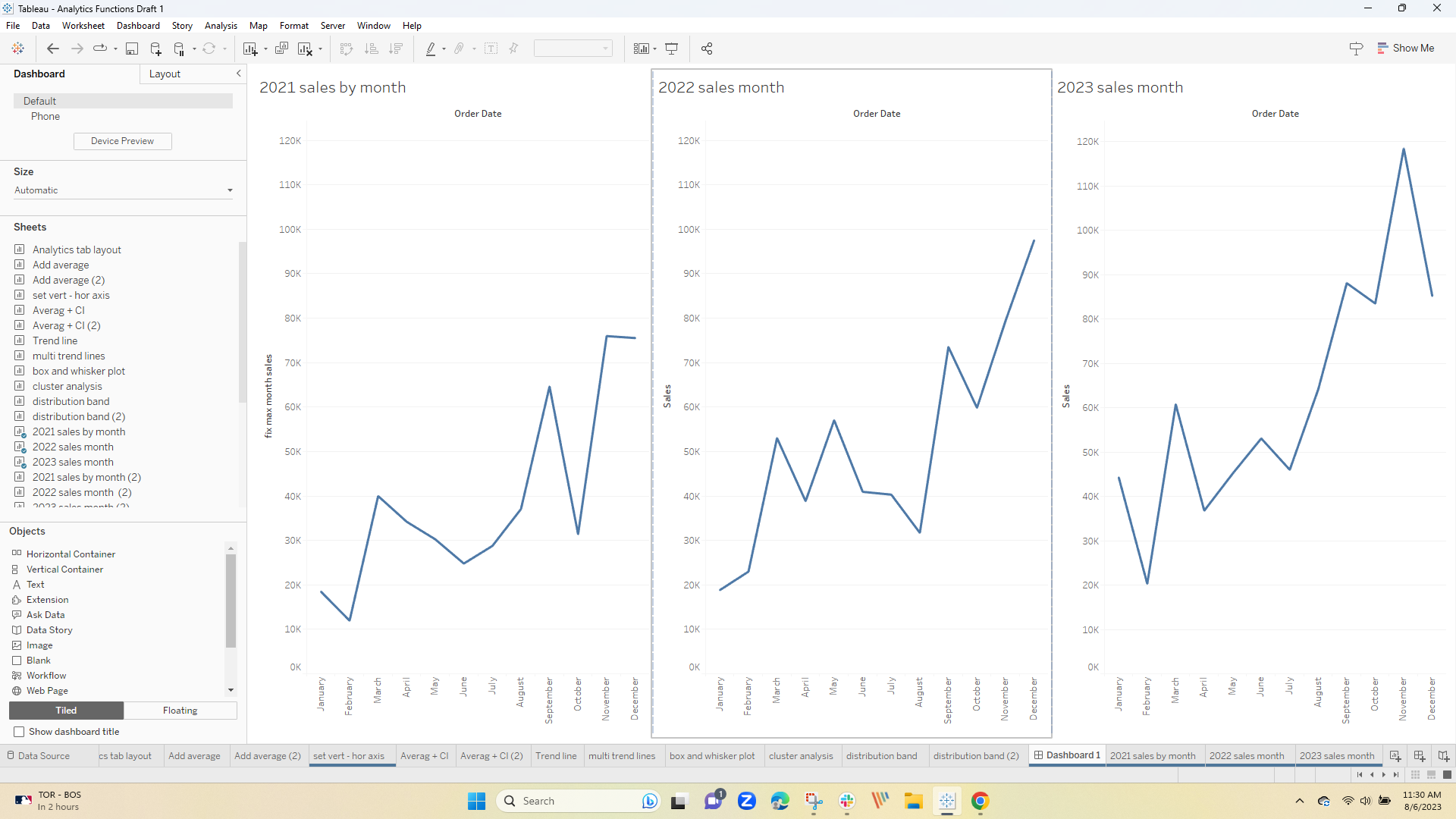
I have colored the line the same as the background and eliminated the ref line text.
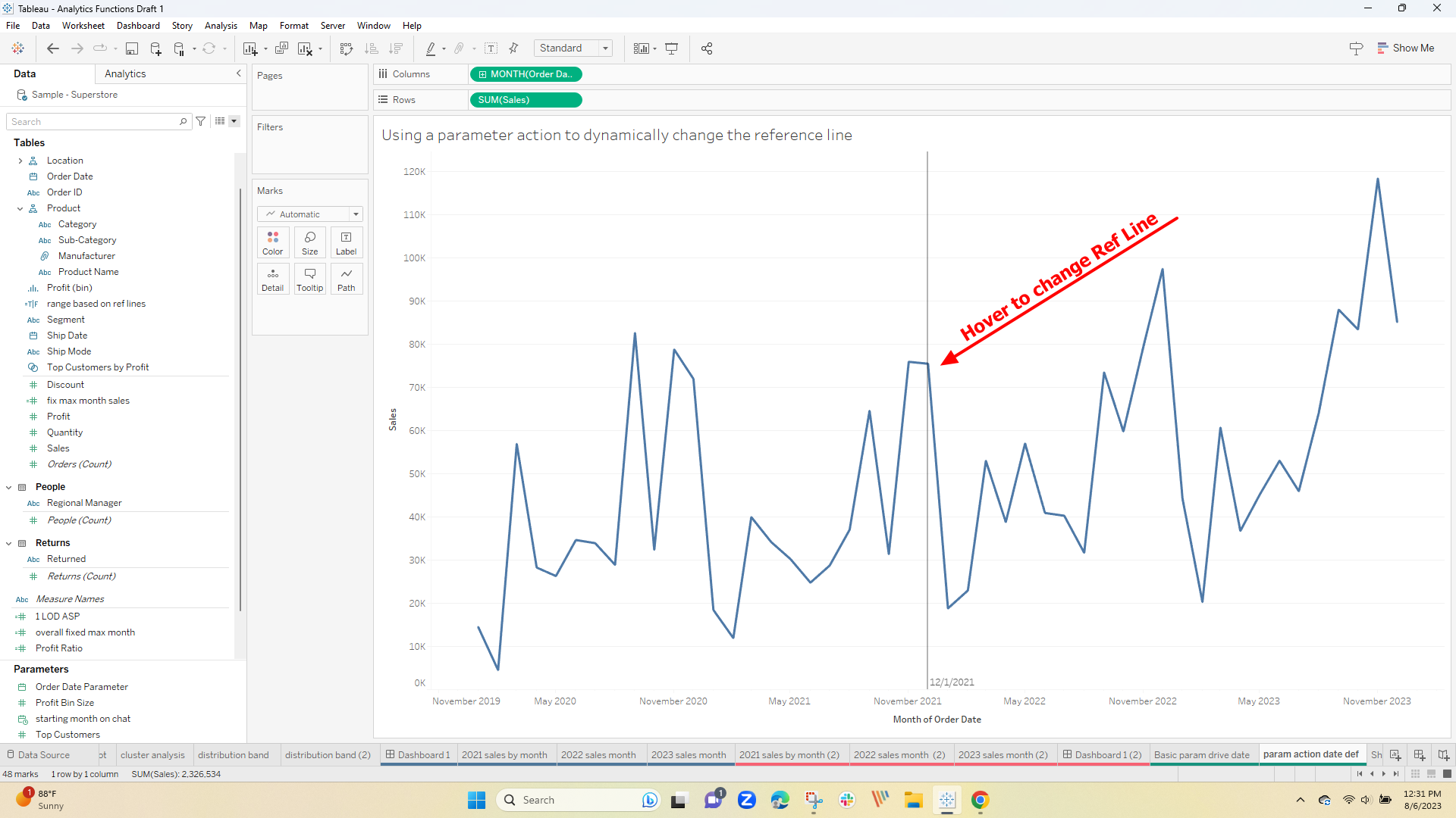
Reference lines can also work on continuous date axes – see the example below where the reference line is parameter driven:
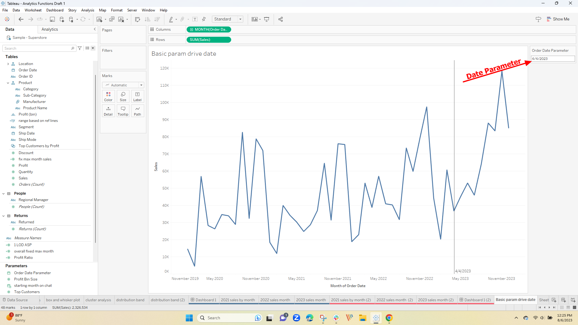
adding this parameter action allows changing the reference line by scrolling the chart
3 Reference Bands
Bands allow you to highlight portions of the viz. The default band is centered around the average and shades the area from the min to the max of the aggregated measure
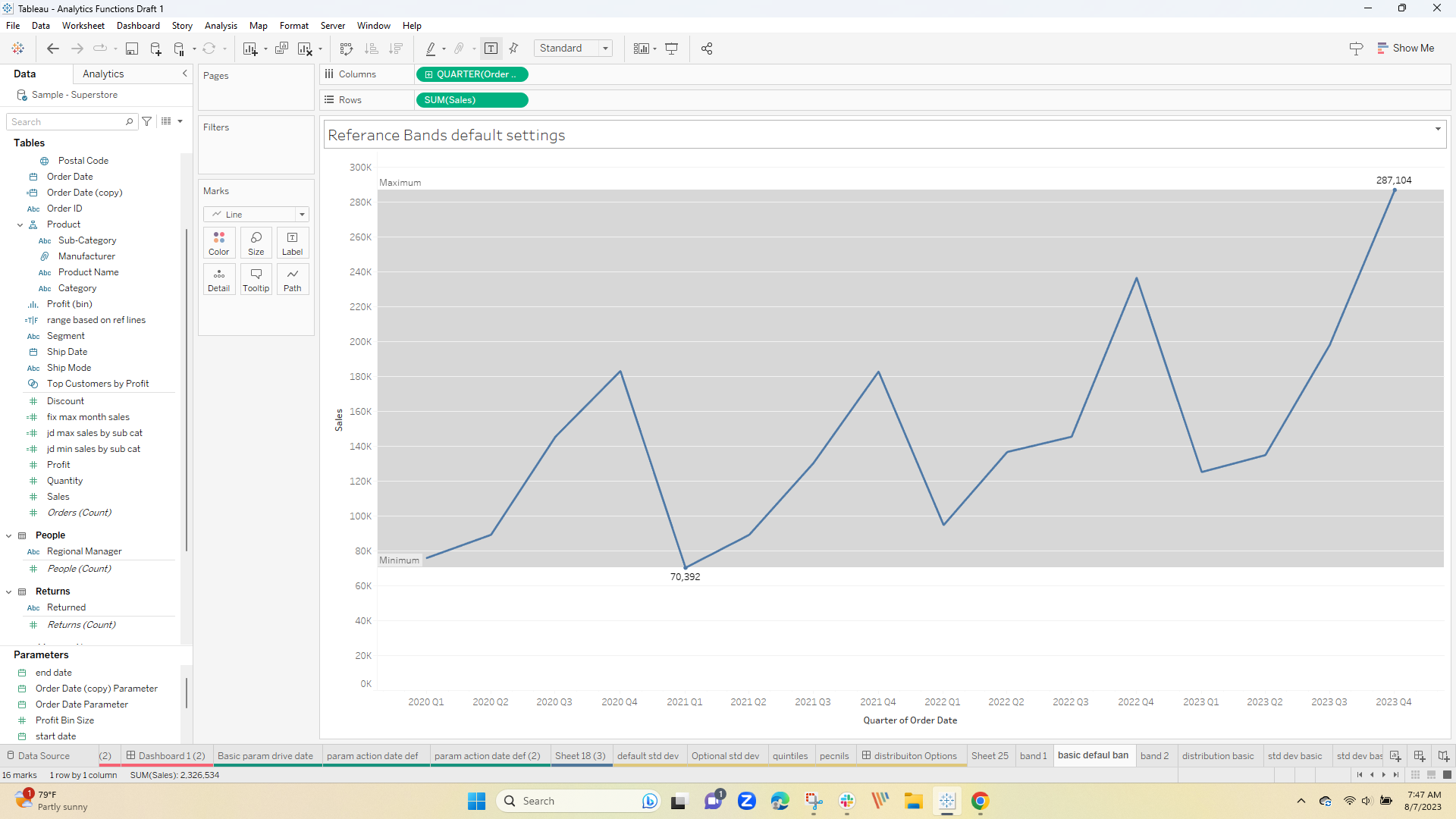
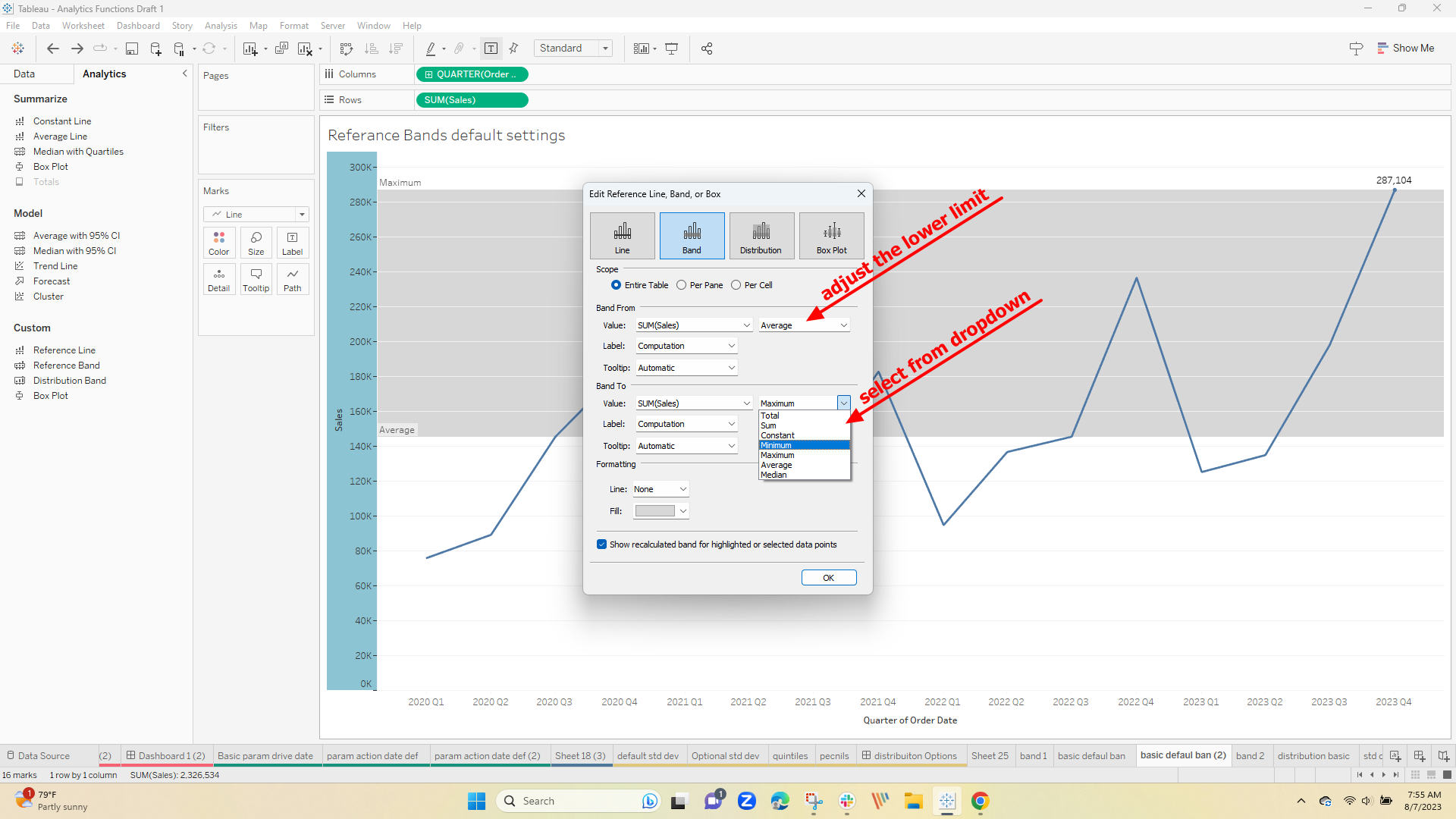
The band can be edited to select the lower and upper limits:
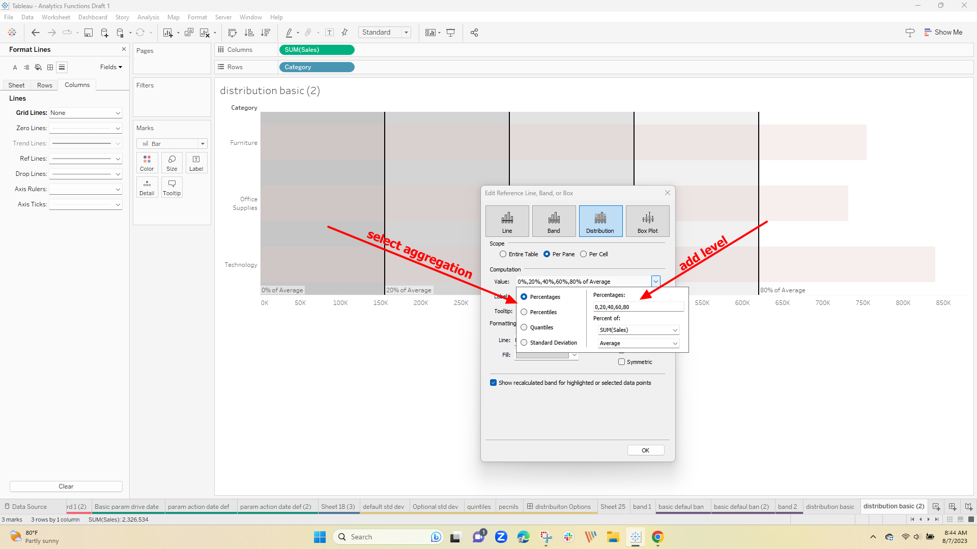
If you want to look deeper into the data – the Distribution option or Box and Whisker plots are options
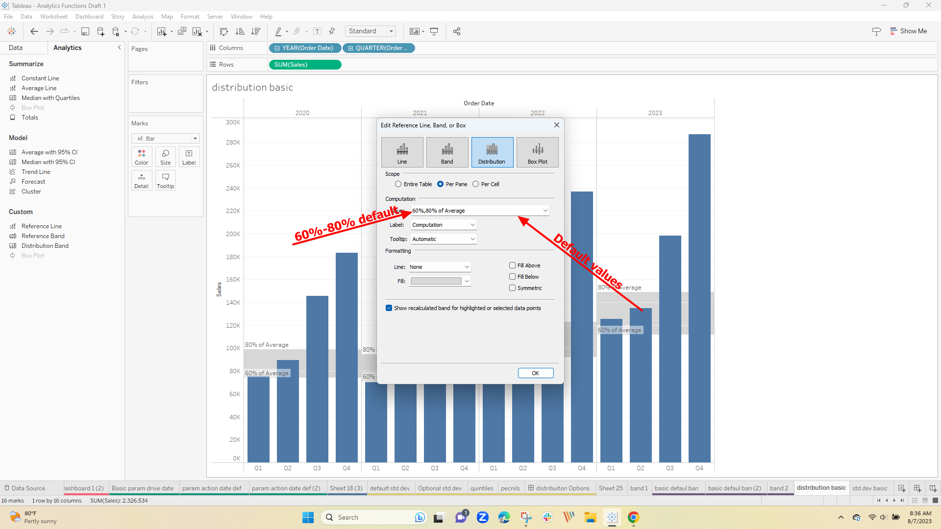
4 Distribution Option
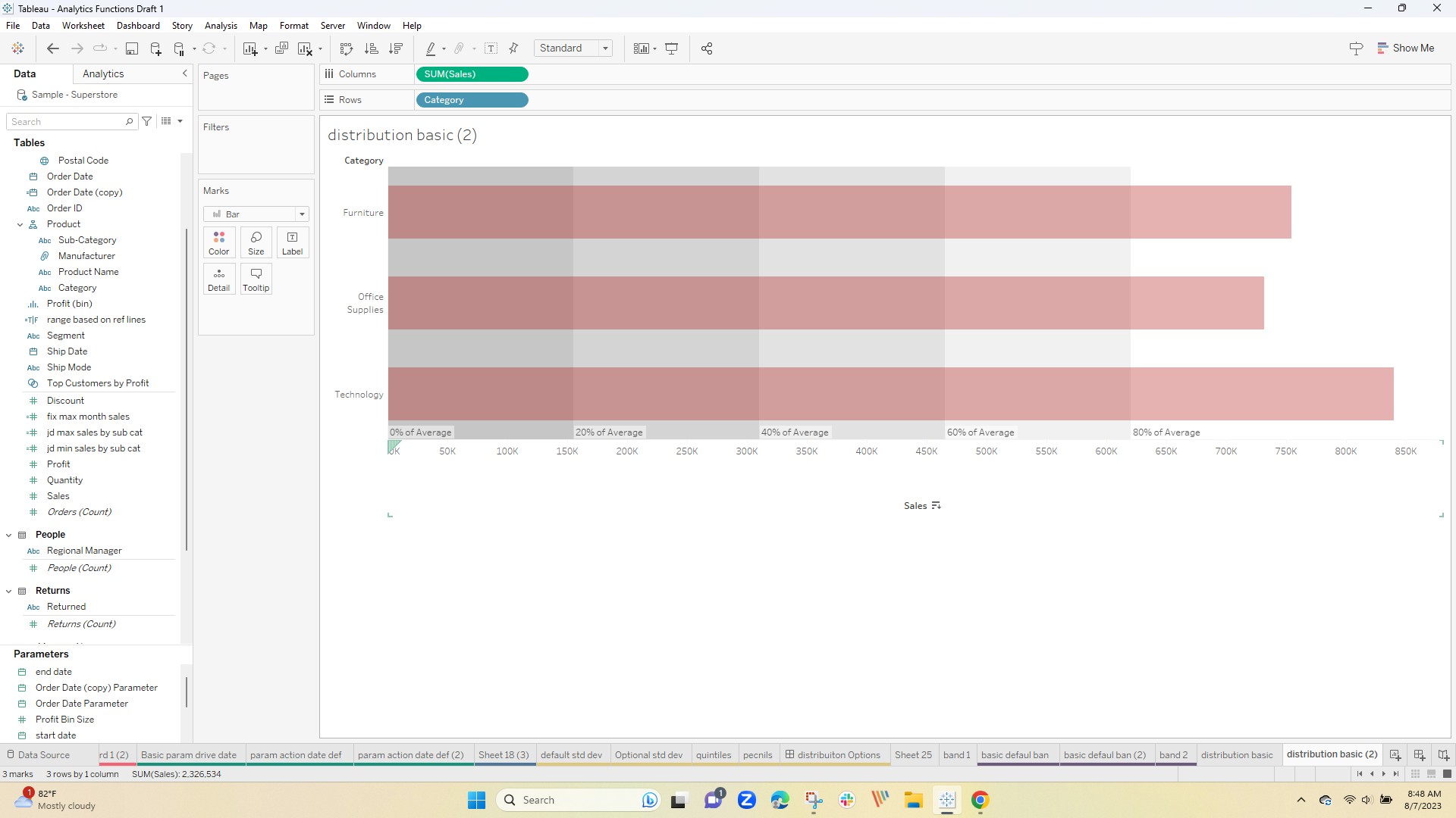
The default settings for the "Distribution Band" are 60% and 80% of the average:
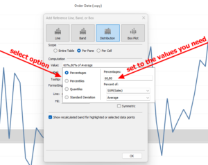
You can easily customize the view by editing the bands to select the aggregation and setting the break thresholds:
to result in this:
or maybe you want to look at the standard deviation across the data, break it into quintiles or look at percentiles – all can be done with the distribution options.
You can select the analysis type from the list on the Distribution tab. Each has default settings that can be changed to meet your need – just select and type in your specific values.
Here are some examples of 4 different types of distributions on the same data:
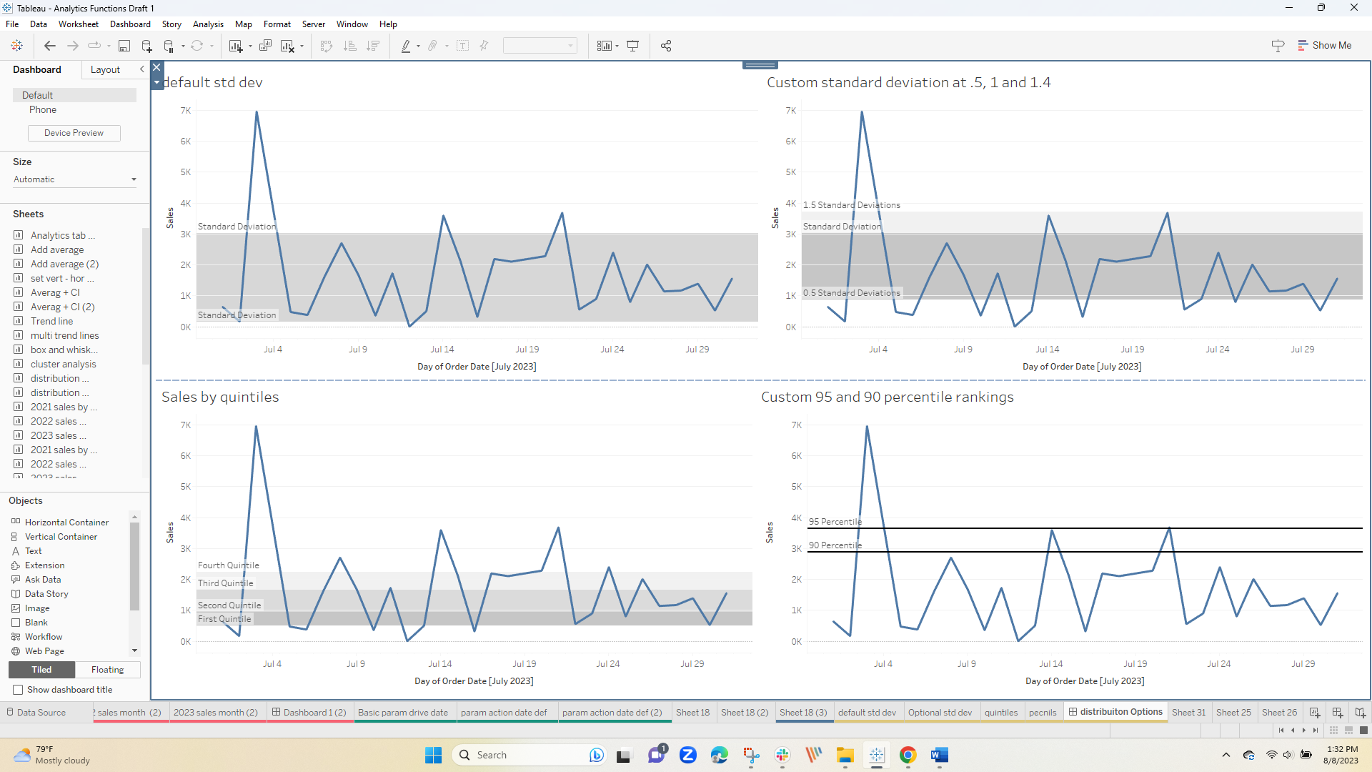
Now you get to have fun – the best way to learn how the options affect the view is by playing with them –
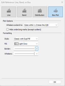
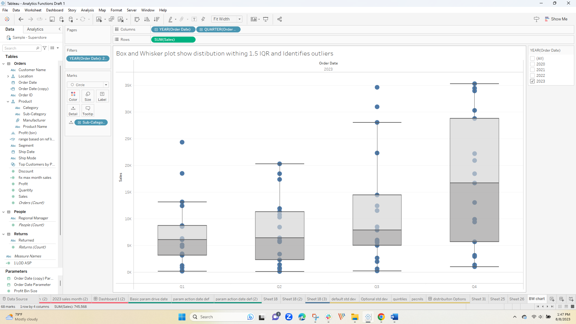
5 Box and Whisker Plots
There is one final option available on the tab – the Box and Whisker plot which looks across the range of all records in a partition, sets the quartiles, and identifies outliers
It can be very useful and is easily added – Start with the setup tab – where I select the dual fill option in gray tones
and that's it – here subcategories are distributed by quarter – note the outliers in the first and third quarters
I hope you use Reference Lines, Bands, and Distributions in your future work – very easy and adds a lot to the viz
The workbook used in the post can be downloaded at Link to Ref Line Workbook
Enjoy
Jim